Saudi telecom - TV EVERYWHERE
IPTV, NATIVE APPS & RESPONSIVE WEBSITE
role: UX DESIGNER | 2013-2014
(MASSIVE INTERACTIVE)

THE BRIEF
To create a cross platform TV service for one of Saudi Arabia's biggest telcos - with a common design language and a faithfulness to the device in which it is viewed. This was a 10 month long project.
STC were looking to completely overhaul their entire Set Top Box and TV Everywhere service across all devices. The project consisted of two stages: Stage One - STB (set top box) and Stage Two - TVE (TV everywhere responsive and native app). The project was pre-magic motion remotes, so we were constrained the D-pad. Designing for TV is always more challenging than any other device due to the restrictions of both the hardware and the input methods. The model had to be kept simple, intuitive, and be light-weight enough to run on the box. Working together, we settled on a fairly traditional grid format, with the main menu easily accessible, and never more than 3 presses away.
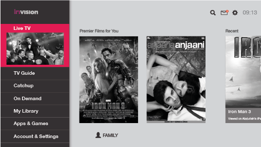
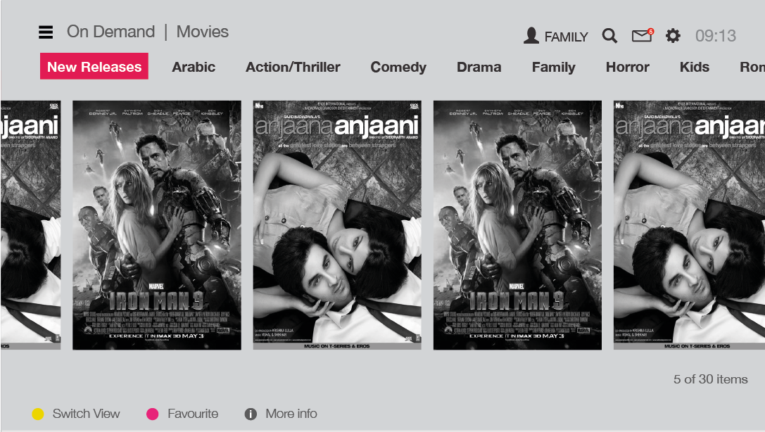
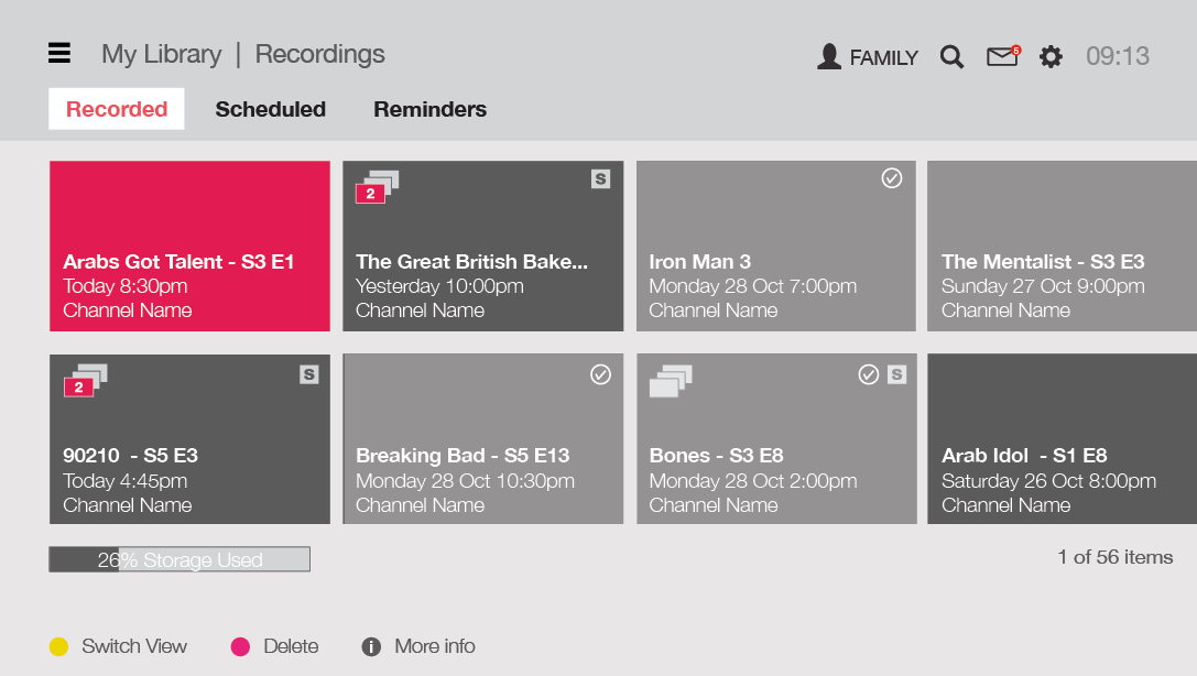
MY ROLE (PHASE ONE - SET-TOP BOX)
Phase 1 was the development of a set-top box, my role included the following: sketching, user flows and client workshops and reviews to establish the preferred interaction model. The navigation hierarchy and service IA were agreed and documented. The templates for the main sections were defined through wireframes - these sections included Home, TV Guide, On Demand, Purchase Flows, Catch Up, Recordings, My Library, Item details, Search, Playback, Settings and Notifications and Alerts. Prototype of the interaction model was created using Axure. For final delivery, over 10 detailed specifications documents were delivered for the development team. All final UI designs were completed by the agency visual design team.
MY ROLE (PHASE TWO - TV EVERYWHERE RESPONSIVE/NATIVE APPS)
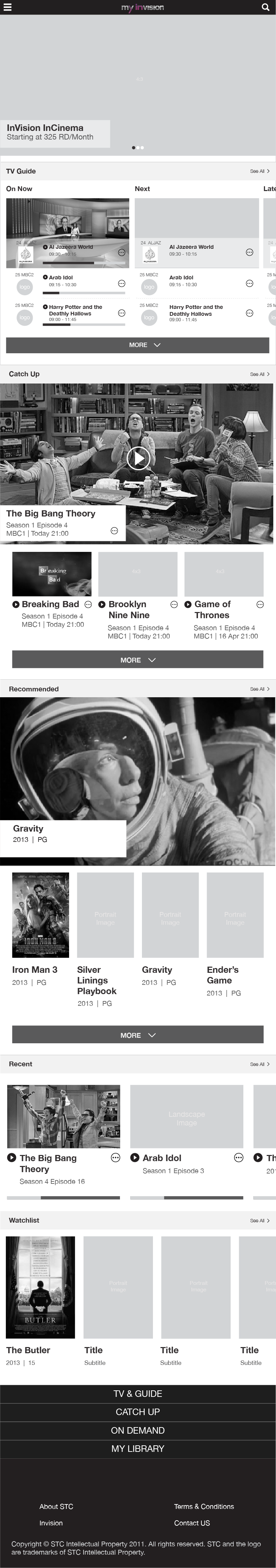
Phase 2 consisted of a is a responsive website which was the foundation for the native iOS and Android experiences. The website was designed using a system of components/modules, not pages, that respond to three base screen sizes. There are two breakpoints and the content scaled responsively. The IA of for the TVE experience is the same as the Set Top Box - with some exceptions. During this phase worked with one other UX designer to create a responsive prototype of the service using Bootstrap, which was used as a proof of concept but also used as a delivery output for the development team.

TVE - MOBILE (SMALL) BREAKPOINT
TVE - TABLET (MID) BREAKPOINT

TVE - DESKTOP (LARGE) BREAKPOINT
THE OUTCOME
A complex and intensive project, the timelines were incredibly tight and required close collaboration between UX, visual design and project management. The biggest success was the translation of the set-top box design to responsive web. Whilst they weren't a direct copy, they reflected each other appropriately to ensure familiarity for users using the service across multiple devices and maintaining a cohesive experience.
CREDITS
UX: Wil Grace, Stephanie Grace
Visual Design: Jimi Rowe, Bec Brodie & Dimple Gohil
Video: Martin Spurway